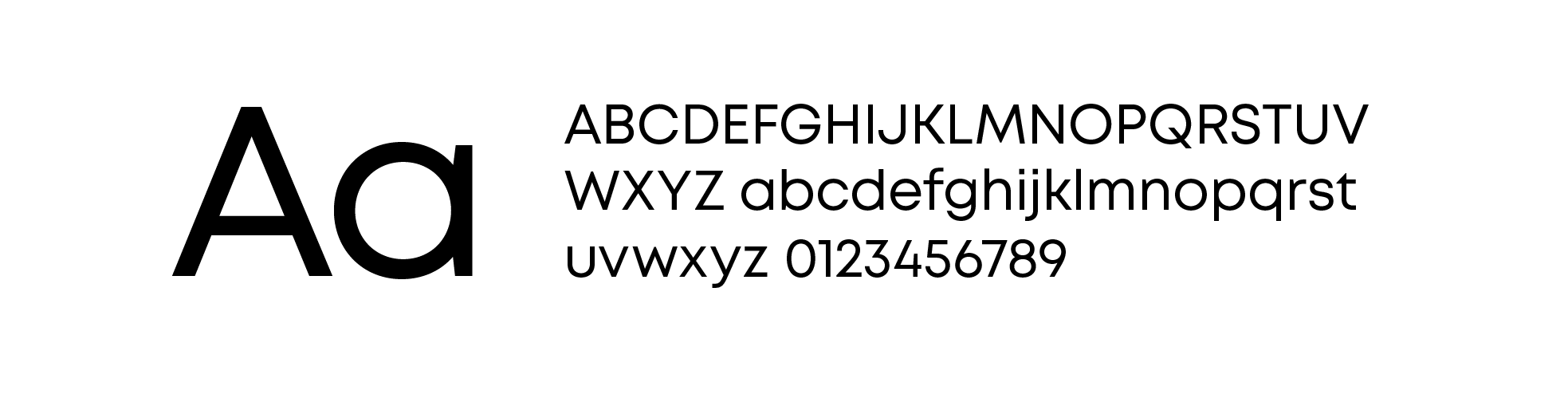
Mont is the primary font for the City of Toledo brand. Mont is a
geometric sans-serif typeface with many weights, a prominent x‑height,
and well-considered features to improve versatility and accessibility
across print, digital, and environmental applications. Its unique form
has plenty of personality for headlines while remaining practical for
long body copy.
10 font weights ranging from hairline to black to provide ample contrast
130 total languages supported with extended Latin, Cryllic, and Greek
Balanced letter design suitable for both headlines and long text
Prominent x‑height to support legibility at small sizes
Versatile design for use in web, print, motion graphics, etc.
Ligatures, fractions, superscript, and subscript support for ease of use
Mont is also reasonably priced for both desktop and digital font licenses. Use the link below to license the font.
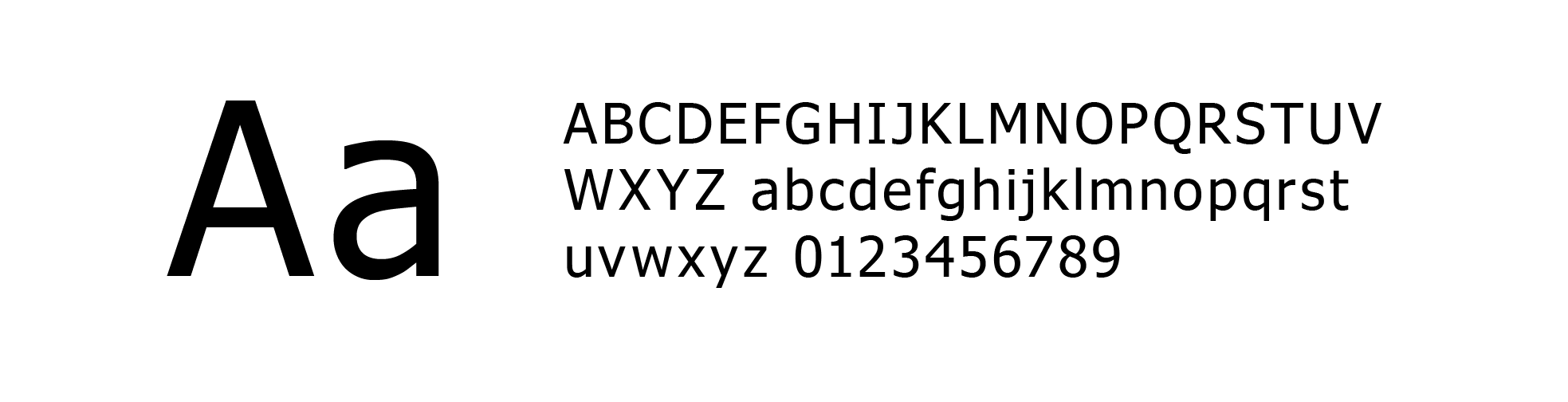
Mont is the preferred font whenever possible for the City of
Toledo brand, but if it is unavailable the alternate font Tahoma can be
used instead. Tahoma is available across all platforms and provides a
consistent option for the brand as a backup.
Readily available for free across all devices and operating systems (Mac and PC)
Multilingual support with Latin, Cryllic, and Greek characters
Offers 4 font weights and styles for typographic contrast
Narrow letter design and small counters for more legible paragraph typesetting
Prominent x‑height to support legibility at small sizes
Type Styles
The brand type styles are set up to be a helpful and flexible
guide for typographic use. The styles outlined below are suggestions
for hierarchy and should be the starting point for all creative styling.
Individual type sizes and leading will vary based on application. The
styles below are set up relative to a standard letter-sized printed
document and should be scaled, as necessary, for larger sizes. When
scaling, the kerning should not be changed.
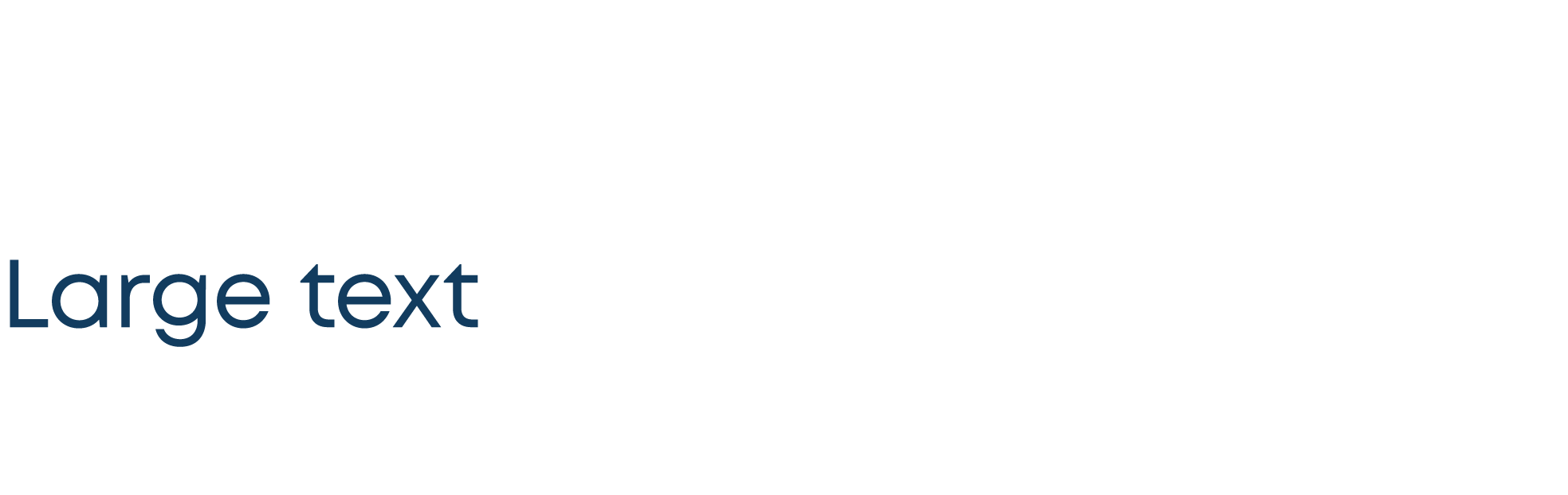
Style: Heavy
Case: Title Case
Kerning: 0
Suggested Point Size: 22
Suggested Leading: 27
Style: SemiBold
Case: Uppercase
Kerning: 200
Suggested Point Size: 13
Suggested Leading: 20
Note: A subtitle should never be longer than a short phrase. The Uppercase styling makes longer phrases less legible.
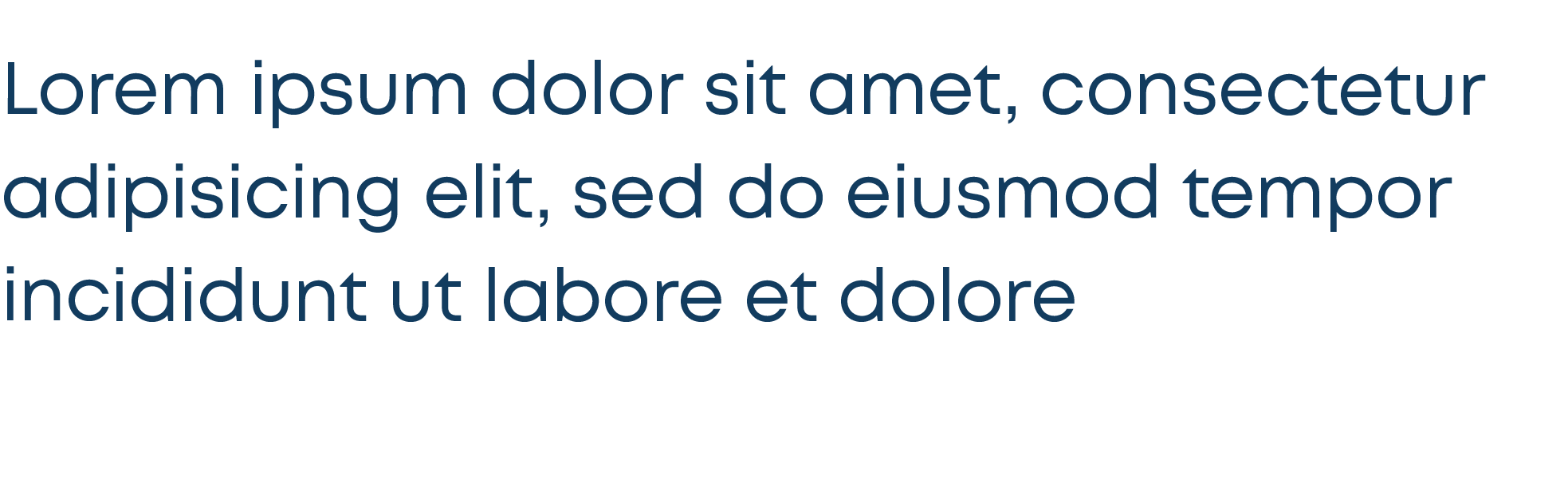
Style: Regular
Case: Sentence Case
Kerning: 0
Suggested Point Size: 13
Suggested Leading: 20
Style: Light
Case: Sentence Case
Kerning: 0
Suggested Point Size: 10
Suggested Leading: 14
Note: Keep line lengths at 7-10 words or less whenever possible, as that is the best length for legibility and ease of reading.
Style: Bold
Case: Sentence Case
Kerning: 0
Suggested Point Size: 10
Suggested Leading: 14
Questions?
If you're not sure on something or need additional materials, please contact the City of Toledo Information & Communication Technology (ICT) Department.